|
I will add more later, but here are some great new COVID resources:
First, Mathematica has helped to pull together some of the top resources and data sources for COVID: https://www.mathematica.org/features/covid-19-curated-data-modeling-and-policy-resources One source I am particularly interested in is the state-level response to COVID: https://www.kff.org/health-costs/issue-brief/state-data-and-policy-actions-to-address-coronavirus/ A great snapshot of the data by country with recovery rates and fatality rates: https://ncov2019.live/data News and data based on your personal location: https://topic.newsbreak.com/covid-19.html COVIDNearYou is pretty interesting as people self-report, which is great since testing has been slow and backlogged: https://covidnearyou.org/#!/#top
1 Comment
I have begun tracking a much wider array of statistics on Coronavirus and will be updating the blog more frequently, but here are some numbers out of Metro-Detroit which turns out to be one of the hotspots for COVID cases and deaths sadly. In future blogs, I hope to integrate data from FlightRadar24 which shows how many flights are still coming into Metro-Detroit from all over the world. In this post, I calculate the most recent statistics for Metro-Detroit. Here we see the number of confirmed cases by County. 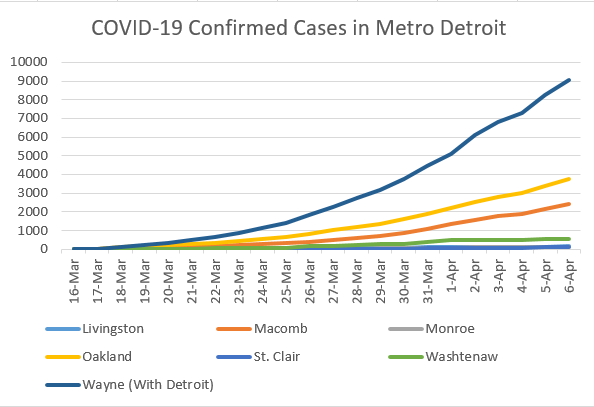 The problem with this of course is that the raw number does not tell us anything about the population size, so I standardize by population. The next visual shows the cases in per capita terms. I notice that the number of cases in per capita terms is still a fraction of 1% of the population. 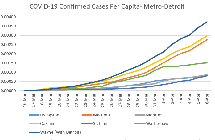 We are of course worried about the fatality rate. So, I look at the percentage of confirmed cases that result in death. But, I am interested in seeing the relationship with population density. I want to do this on a broader scale, but for now focus on metro-Detroit in tabular form. I intend to run correlations when there are enough counties to establish this relationship. I am still very suspect of the data, in this case Monroe County is reporting no deaths but this is likely a statistical improbability based on the number of confirmed cases. 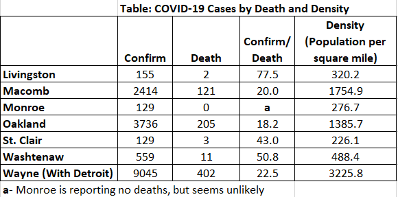 In the table above, from April 7th, we see that the number of confirmed cases that result in death varies considerably (18.2 to 77.5); however, there clearly seems to be a relationship between this proportion and population density. Yet, we also know that density is associated with many other demographic factors and to appropriately analyze these relationships we need a larger data set and to control for many other factors. This will form the basis of future analyses.
Here are some more updates on the hospitalization and deaths per capita rates reported by covidtracking.org. As it stands today, the median state hospitalization and death per confirmed cases (positive cases) are 9.1% and 1.4% respectively. It should be noted that deaths per confirmed case will likely get much worse if we continue to overwhelm our hospital capacity, and particularly if we infect our healthcare workers. Here are the graphs by state, but again keep in mind that data reporting is sketchy and testing may be a function of greater state capacity to offer testing. As for reporting, I first display hospitalization rates by confirmed case which varies from close to zero (again reporting may be an issue) up to about 30% of the cases, with the median hovering around 9.1% as of March 28th. 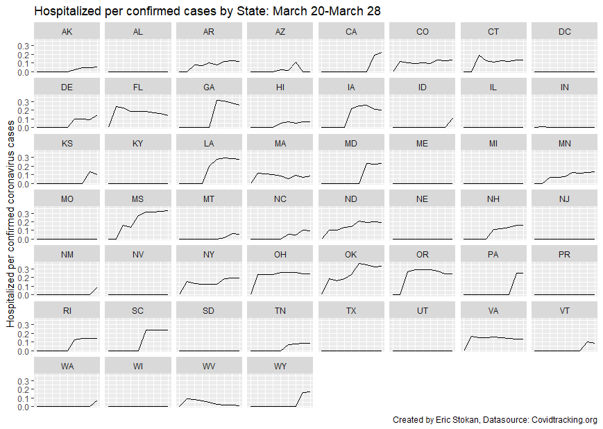 The percentage of deaths per confirmed cases by state varies between 1% and 4%; however, keep in mind that many cases are still active and thus this percentage will likely increase. The median rate of deaths per confirmed cases by state as of March 28th is 1.4%. 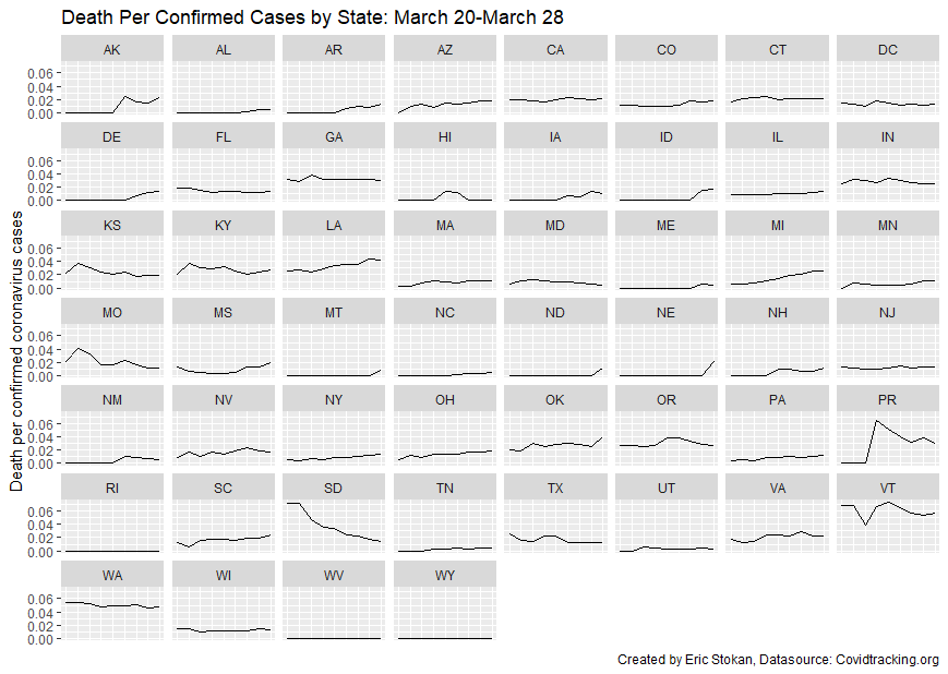 So, many of you have asked why I excluded NY from the early trajectory rates of COVID-19 infections. I did it because everything is scaled at the same rate for a cross-state comparison. I took care to standardize by population, but still the growth rate in NY has been such that it has so vastly outpaced other states that it makes the situation in each other state not look dire or like the rates are staying flat. They are not, NY is experiencing this earlier and much more rapidly given it's connections to the world economy, as well as the sheer density in the NYC region. While that combination can be great for an economy during good times, it can wreak havoc during a global pandemic. So, to provide you with the info you want here you go. I will first present without NY and the follow it with NY rates through March 28th. One note, the trajectories look roughly the same but the scale has changed. It is still a fraction of a percent of the population in states; however, the rate by which that is increasing is what should be concerning. 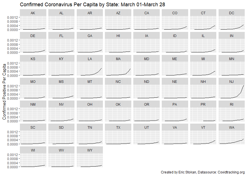 Now, I am taking all of the same data, but adding in NY. Here is the updated figure: 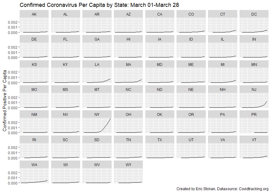 I am going to update this post as I get new information that I think is particularly important and hopeful during all of the negative news we are receiving. This isn't just made you to feel better, these are stories that may meaningfully have an impact on reducing infections, understanding their spread, and recovery:
Clinical Testing: This wonderful visual by visual capitalist has created some nice charts for every possible vaccine and treatment for COVID so far. Let's hope several of these work! How Do We Slow the Spread? By far one of the best articles I have read on the topic of measures we need to enact by Pueyo. This is a great foundational article that describes what we need to do to counteract the negative consequences of COVID-19. Testing is So Important (See Above Article for Why)- And Now it May Get a Lot Easier and Quicker: VOX has reported some good news about testing becoming easier and quicker. We will be able to test and get results of COVID-19 in a matter of minutes instead of weeks. This will allow us to more appropriately understand what we need on the social distancing side. Immune Patients May be a Solution As we move to full scale testing of the population, see above, there is a good chance that we will be able to use blood from those that are immune and/or have recovered to get through this. This would not take major FDA approval as would a medication that could treat. Increasing the Number of Ventilators in this Country The country needs more ventilators and production capacity of these is innovating and increasing. Please let me know what else I should be posting here. If you saw my previous post on state per capita confirmed rates of coronavirus over time, you may have had some additional questions. This is particularly important, especially regarding confirmed cases by the number tested (Thanks to Thomas Schaller for clearly pointing this out). I start by dispalying the updated totals in Figure 1. NY is still removed from this particular table, because it mitigates the effect of many others- this will likely change as the pace of this increases by state sadly. Next, I look at the percentage of those individuals tested who do not have Coronavirus. A couple things to note, there may be double counting which is a concern. Some individuals are testing themselves multiple times and some may have an immunity. There may also be many more who would be negative were they able to get tested. Ideally, we would all get tested right now and strictly quarantine based on the results. This would limit the spread and allow others to get back to work and ensure the sick have the time to recover while the healthy and immune could return to work- particularly in ways to assist the rest of society get through this. States may be hesitant to report negative cases because there is fear that individuals may take it less seriously in that event. I think more information is better than less and note some of the caveats above. Testing data is important as is making it public so we can better understand this. Thus, I report the percentage negative relative to positive and negative cases. 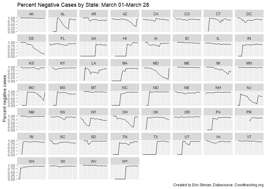 Because of the many discontinuities, it is clear that in many cases the state was not reporting the negative cases early on. So, I truncate the sample to dates from March 20th-28th when data becomes more reliable. 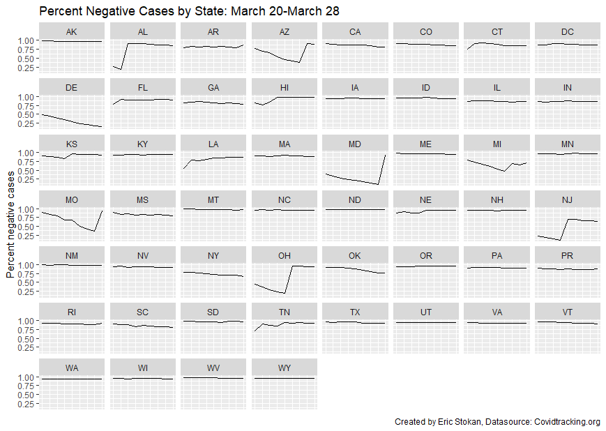 On average, as of March 28th, the percentage of cases that were negative was 88%. That means, so far 12% of those that have gotten tested were confirmed as infected. This is not overly meaningful given that some people will be tested more than once and many others will be more apt to get tested given the concern around COVID-19; however, testing rates by state on per capita terms is important as is the number of confirmed with hospitalization rates- so check this out in a future post.
The United States is currently in the beginning stages of grappling with a global pandemic due to the Coronavirus. Unlike many other countries, the national government has not elected to issue a stay-in-place order to ensure proper social distancing and stymie the impact this virus will have throughout the country. Rather, they are leaving it to the states. States are pursuing different strategies, so I am going to be tracking and analyzing those strategies and seeing what impact they have had on the growth rates of infections. I have created a Coronavirus infection rate by state standardized by population- so expressed on a per capita basis. I will be updating the visuals. One visual excludes NY because their trajectory has been rising so rapidly it visually skews the others to have them on the same graph even with it standardized by population. Density will matter a lot in the spread of this disease, as will the timing and type of policies that are enacted. The data for this run from March 6th through March 24th and come from the following source: https://covidtracking.com/api/.  I certainly hope that states take this seriously as other countries are showing us the devastating effects by not instituting restrictive measures.
I am going to start highlighting mostly new data sources that are useful for evaluating the impact of various economic and community development strategies at the state, county, and local levels:
State-Level The first source by Armanios, Lanhan, and Yu (2019) focuses on state-led tech-based economic development policies: https://cms-staging.andrew.cmu.edu/epp-2/stategovexp/ This source is focused on providing a Panel on incentives and taxes across 33 states and 45 industries over a 26 year period https://www.upjohn.org/bied/database.php County-Level This source is focused on providing GDP stats at the county-level. https://www.bea.gov/data/gdp/gdp-county Roy Meyers, professor of political science at UMBC, and I, argue that we do not think Maryland on Amazon as it was able to avoid the winner's curse. You can see our op-ed here.
Many of those who study economic development increasingly understand the importance of economically inclusive regions. This generally means a strong interconnection of economic activity within the region. For example, the Central Business District would be economically tied to neighborhoods within the city and the central city would be connected to outlying hinterlands. Recently, the Brookings Institute has released a nice tool to explore the intersection of economic growth (Size of the economy), prosperity (quality of growth), and inclusion (distribution of growth):
Link to the Tool |
Eric StokanI am an assistant professor of political science at the University of Maryland Baltimore County (UMBC). I completed my Ph.D. in Public Policy and Public Administration at George Washington University. Archives
February 2022
Categories |
 RSS Feed