|
Much of what I am working on today can be found under the Data Visualization page. I am making efforts to leverage unconventional data to answer pressing local government questions. Feel free to give feedback.
1 Comment
The CDC creates variables that demonstrate at the tract level how vulnerable a community is based on a large number of Census variables. You can read more about the project here: https://svi.cdc.gov/data-and-tools-download.html
For those of you that are interested, I pulled this data for the years: 2000, 2010, and 2014. I then create change measures. My descriptions and the Rmarkdown file can be found at my Github page: https://github.com/EricStokan/SVI I am doing this work in line with a project through the Metropolitan Governance and Management Lab (MGMT) at the Indiana University Bloomington with Deslatte and Helmke-Long: https://mgmt.lab.indiana.edu/people/index.html. In a recent article in the Urban Affairs Review with Aaron Deslatte and Megan E. Hatch, we find that local governments can overcome the "lock in" effects from previous economic development decisions. It takes concerted commitment across different levels of government to ensure greater equity within communities. Finding mechanisms to mitigate economic development competition between neighboring governments could ensure a more equitable growth path, as can greater own-source resources. The last level, own-source resources, will be tough as local and state governments grapple with the economic implications of COVID-19. Thus finding additional solutions to overcome these hurdles will take work.
Co-authors, Darrin Wilson, Brad Johnson, Michael Overton and I, in a recent Public Administration Review article, suggest that the Institutional Collective Action framework is one path forward whereby local governments need to find innovative solutions that foster greater coordination and cooperation. Dividing the innovative approaches underway into those that are supply- and demand-side, we suggest what is happening and how governments can leverage these relationships to ensure economic recovery. Aaron Deslatte, Megan E. Hatch, and I, in a recent Public Administration Review article, also suggest that achieving greater equity and sustainability as a result of COVID-19 is a possibility and they should use current grant structures already in place to do so such as the Community Development Block Grant (CDBG) and the Energy Efficiency and Conservation Block Grant (EECBG). I have created my first GitHub page which was far easier than anticipated. There is much work to be done, but I used RMarkdown to compile data from Johns Hopkins and Covidtracking.com which can now be found here.
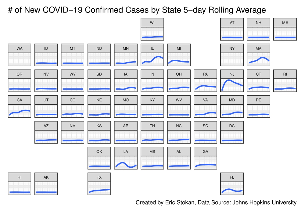
Please feel free to provide comments about how to improve the github page and/or the Markdown script. We can see that many states are starting to decline in terms of newly confirmed cases; however, more needs to be done. Across states, we still need much more testing and tracing. For a full description of its importance, see the work by Brookings on TRACE: https://www.brookings.edu/about-trace/
It has been some time since I posted last, but I am still tracking COVID-19 and analyzing infection and death rates and governmental responses to it.
I'm working on integrating R Markdown into Weebly, but until then this provides just a flavor of what I am working on: Let me start with a provacative question: How serious is COVID-19? Clearly it is deadly, and you need look no further than the constant headlines of the NYT, follow just about anyone on Twitter, own a Facebook account, or just basically not live under a rock (Maybe your safest place currently). But, we have a really really hard time right now understanding the magnitude of this. It really shouldn't be quite this hard though- we need to make some short-term tradeoffs for a clearer understanding of long-term tradeoffs.
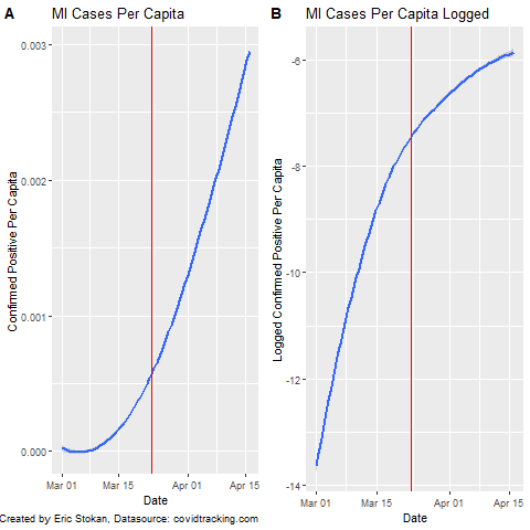
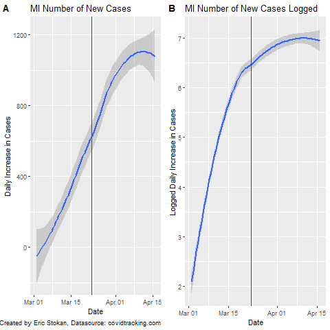
I propose two ideas, both involving random samples of the population. First, we randomly sample ~1K to ~10K individuals to receive tests. We may need to provide incentives to these individuals. We need as much participation as is possible. Because, those who are less likely to do it may have behaviors that are different than those who do and related to being positive. We need to track everyone we asked to participate. This will give us a better sense of the true percentage of the population that are currently affected. Maybe better, Abbott Labs has apparently just produced an antibody test that would allow us to know who is immune as a result of already having it. Of course, there is some percentage of the population that had it and perished because we didn't test early enough; however, if we did a comparable random sample we could track the sub-sample that did not have it over time and see what happens as we re-open the economy. We would also have a sense of how many in society currently have it- by the way we may be able to use their blood to help others recover. Given that 25%-60% of individuals may be "silent carriers" an Economist article suggests the infection rate may be 200X what we think it is. In the US, this could mean more than a 1/3rd of the population has already had it. That would actually be wonderfully welcoming news (Like very seriously some of the best news you have heard since this started) because it means that most of us are immune and a really large percentage of us are asympotomatic and it won't be fatal. This doesn't mean to go out now and celebrate- we can still overwhelm our health care system and many will die who would otherwise survive. Our elderly will still be at great risk, and we can still protect them through smart policies. We don't know if the economist article is right, but I believe we would have a much better understanding of whether this is the case if we randomly test about 10K individuals across the US with these Abbott tests. Even now, that would be taking one days worth of tests or less and using it to this end. You will notice that most of the charts I have produced rely on a linear scale; however, some like @JamieFlournoy suggested that displaying it this way is problematic as using a log scale should be better. This has recently been elaborated upon by Sevi et al. (Forthcoming) in the Canadian Journal of Political Science (Manuscript here). So, I decided to just quickly display both types of plots here as the Sevi et al. article makes clear that we perceive these very different despite them providing the exact same information simply scaled differently. As a note, the red line represents when MI put their "stay at home order" in place. Going forward, I will be analyzing state policies to determine how policy responses have impacted important COVID-19 related outcome measures. Because expressing these data in per capita terms provides a scale that is not as easily interpretable, I also provide the number of daily cases (new) in MI and the logged number of new cases. In actuality, we know that testing rates in MI are quite low right now relatively speaking - even the death toll is undercounted.
These different charts are simply meant to show how important the scale is when interpreting what the data display. We need to be even more careful regarding how we interpret the data and the limitations that exist. We continue to try and sort out the data and information coming in on COVID. At points it is a challenge to make sense of- but luckily groups like Data Driven Detroit are here to help. See their page on how to interpret much of this data.
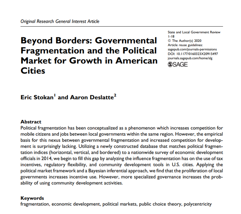
If you are focused on incidence rates, I've been contributing to Drawing Detroit's analyses on the region. There are many decisions and assumptions that have to be made because of data quality, but we all need to identify those as best we can. One issue we all have right now is how to separate out new confirmed cases from the fact that testing rates are also increasing. A seemingly obvious way to do this though is to look at trends in newly confirmed cases as well as trends in deaths per confirmed case. When we have reporting on total tests (both positive and negative this is not as big of an issue). If these are truly new cases then the death toll should continue to increase with some lag; however, if this is a result of testing we should not see such an increase. This is a testable proposition and we can determine the lag from new confirmed case to death and use this to understand whether increases in testing are the primary driver of newly identified cases. The lack of testing has increased the death per confirmed cases in MI considerably according to Deadline Detroit. I have a recently published an article, with Aaron Deslatte at Indiana University Bloomington, at State and Local Government Review where we explored whether metropolitan areas that had higher levels of fragmentation (meaning more general purpose governments) that spanned more than one state (we coined this "Bordered fragmentation" to indicate its uniqueness from "horizontal" and "vertical" fragmentation) lead governments to utilize more economic development incentives. We found that to be the case, but it also mattered whether the government was run by a manager or a mayor. Finding mechanisms to mitigate these ultra-competitive environments would be beneficial to regions in addressing this misallocation of resources. You can find the article here if you are interested.
Also, one such anti-poaching arrangement in light of COVID is happening in one of the regions that spans multiple states metro-DC.development-leaders-in-six-counties-form-regional-alliance/ |
Eric StokanI am an assistant professor of political science at the University of Maryland Baltimore County (UMBC). I completed my Ph.D. in Public Policy and Public Administration at George Washington University. Archives
February 2022
Categories |
 RSS Feed